Lessons
Class Introduction
09:19 2Language and Properties Of Light
07:59 3Position Of Light
04:43 4Terminology
03:10 5Science Of Light
16:47 6Dynamic Range
05:49 7Golden Hour
00:47 8Reflectors
01:22TTL Metering
10:47 10Studio Equipment
07:46 11Softbox vs. Umbrellas
02:17 12Intro To Flash Photography
12:41 13Color Balance
02:29 14Dragging the Shutter and High Speed Sync
05:22 15Light Metering
07:53 16Studio Strobe Science
05:30 17Three Light Setup
05:40 18Low of Reflection
03:18 19Understanding Histograms Part 1
04:42Lesson Info
Position Of Light
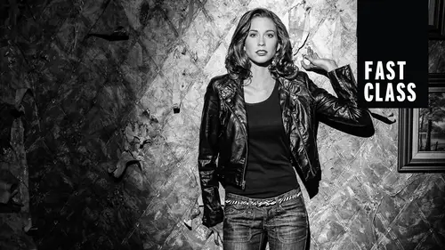
I wanted to show this picture really quickly. Um, because the, um, the Creative Live banner has had this image posted for months, and I wanted to show exactly how it was created. This is actually a behind the scenes picture of me making this photo, and there are three lights in this photo. We're gonna learn about how to do that. The light behind me look small, but it's actually six feet wide. It's a six foot wide by four foot tall soft box. It's really, really large, and I'm actually standing in front of it, and the light is going around my body and hitting the front of this model. The second light, this big square soft box right here. This is what is getting a highlight on the models shoulder and her hair, but that photo originally was sort of dead. Didn't have much flair to it. So what? I decided to do that third light, the really small round light there. That light isn't falling on the model at all. It's shining straight into the lens of the camera, and so it's just there to create ...
some lens flare, something that you would normally avoid for this shot. I wanted to add it. And so I have a before and after shot here. So the shot on the left there's the shot of just the two soft boxes, and you can see it's just sort of flattened, flavorless. There's not much going on, but by adding that one light shooting into the lens, we added this lens flare, and it just gave it that little extra punch of of what needed to happen. So that's that's how that was lit. Okay, we're gonna do a demo. We're going to talk about color and light because we have a little bit of time to do this. All right, We're gonna do a portrait here, and I am shooting this with an aperture value of 2.8. I'm just using my built in meter, and the lens cap is on. I saw We're gonna zoom this in. There we go. And here is the image that came up. Watch what happens when we convert this. So this is color this color temperature. Well, we need to fix that and a little bit, but all I'm going to do with this image is I'm gonna take it from color to black and white. In fact, I'm gonna create a virtual copy really fast. So we can we can do that. So I'm to go here, convert this to black and white will increase the contrast just a bit. All right, so let's look at these two images side by side. What you'll see is that this image in black and white looks pretty good, right? So, um, the color image there, we don't really like that. It just It just feels it's really orange is not so good. But as soon as we make that go to black and white, it's so much better now what we're gonna do, we gonna do almost the same lighting. But what we're going to do is we're going, Teoh, uh, use a small soft box on here. What the soft boxes doing, by the way, is the light is coming through here, miss hitting a couple of diffusion panels. And so, as it travels through this when it hits this, there are a couple things that are happening. It's going to spread the light all over the place. It also takes the light from a small light source to a much larger light source. So are effective size gets larger and then also because this has walls to it, it's keeping light from spilling all over the place. And we're gonna later learn the difference between an umbrella and a soft box. And one of the big differences is thes walls and how we can control the light. So that gives us a nice directional like, OK, I'm gonna throw this in here. And also the thing that I'm doing, um, is I'm going to try to keep this as a vertical soft box instead of horizontal. So some soft boxes air not square, and so they could be or is uncle or vertical, And you can get different looks based on how you position that. So we're gonna blind Lex again. But I am awesome. Okay, Lex is gonna look beautiful as shares does. There we go. All right, So now let's take a look at soft light versus hard light, side by side. So you see that soft light in color looks much better than the hard light. So if we will convert, this will convert this soft light to black and white as well. So we take this guy. We're gonna create a virtual copy just so you can see that, Then I'm going to do the exact same conversion. Really fast seeing settings, Yes. Synchronize everything. And now look at the difference between the soft light and the hard light for contrast. So for black and white, the punchy light well, generally look better. I would do some other things with that that hard light to position a little bit better, but you can see the difference. That hard light gives us higher contrast and much more pleasing black and white image than the, uh, the soft light.
Class Materials
Bonus Materials with Purchase
Ratings and Reviews
Student Work
Related Classes
Beginner