Lessons
Lesson Info
Using Tabs and Tables
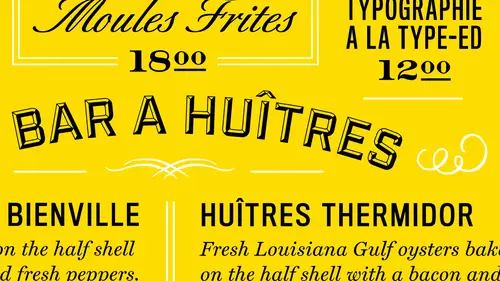
So the thing is with menus let's say restaurant menus that we're talking about today as an example to use tabs and tables um the whole thing is about leader lines the pricing and the dish so you have kind of three or four levels of content here and the leader lines are used for er to get our eye to go across the page to get to a price and this is just one technique for menu design but it's pretty common you see it quite often so you're going to use tabs in design to allocate where these you know uh divisions of content happened okay for tables the beauty about tables is is you can organize the content are like a large format menu liked example that I'm going to show you later and then use tabs within those two further organize the content and get everything the line up but tables are extremely efficient and design because they keep everything organized on your grid like this beverage example here we've kind of highlighted the bars here just so you can see it more prominently but it's r...
eally good for ah charted list like this so lastly you want a garnish wisely reason the term garnish a cz like a synonym for what I would say massaging type and that's where you do all your refinement okay massaging the type s attorney I'm always used over the years and then you can add in um you're elements like images or embellishments or flourishes or anything like that that can draw the eye further to the content that you want to go to you want the reader to go to and then color for me has always been last because it's such an emotional part of design and I'll show you how I've set up a little system that makes it very quick to decide on color through the style sheets so refining the details one of these things that I look at when you have a bunch of content like this is try to get the content massaged well, you don't have this when we're reading you you try to want to stay away from this back and forth kind of rhythm you want to try to stay clean on both ends where their creator khun find their way across without interfering with certain kinds of content so you want to try to break it maybe before the price you're still you're still looking at rags here it's a flush left system so you want to try to find a place in here that's going to rag uh nicely and then what's I've got a baseline grid and I placed everything on the page is faras the grid in the type then I start to tow adding the images where they had here too that greatest well imagery is always second that's kind of one of those fundamental rules for me
Class Materials
Bonus Materials with Purchase
Ratings and Reviews
a Creativelive Student
InDesign is a program I use on occasion so this class has been great for a quick refresher on making it work for me. He keeps it clear and concise so it is easy to follow. Even if you are using a newer version of InDesign this class will help you.