First Image of Your Portfolio
Lesson 2 from: Creating a Portfolio with Impact: From Shoot Through PrintJoey L

First Image of Your Portfolio
Lesson 2 from: Creating a Portfolio with Impact: From Shoot Through PrintJoey L
Lessons
Lesson Info
First Image of Your Portfolio
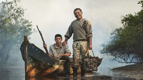
That's the actual physics of the book, if you will on. But they're just the binding that holds together the Okay. So opening the book, this is actual strategic first page. Because with shipping, the first page will rub against this, uh, material. It'll chip being cough. So, actually, just have a blank first page with some contact information of my photography agency. Yeah. So before we even get into the big impact coming? Yeah. Cool. Okay, so the first image of the book, I think that this is human beings love first impression. And the first image of the book is the same like that. I think, as a photographer, your first image displayed should try to say the most about you and the work that you do. But also, just be a nice image to open arm. Okay, so I'll explain why I chose this image is The first thing is, this is a project that I did for Lavazza. I shot this year's calendar. Each year they put out a new calendar in which they choose a photographer to do so. Steve McCurry did last year...
. And Liebovitz day of the flash Appellate is a huge honor honestly to be part of it. But the assignment was they're going to send me to their coffee fields and other agricultural projects that they support that are connected to slow food. For a 40 day project in five different countries, it was like a dream assignment. So this is an oyster farmer, and the reason why it's the first image in my book is because as we go through, you'll see that I do a lot of commissioned projects, but also a lot of personal assignments. So because this is a commission, but it's photographed in the same style as a personal project I want to open with with it. Also, I have the problem that a lot of my work is sometimes a little dark and sinister, and that's actually not the kind of person I am. I mean, I love serious work, and I take my work very seriously. But, you know, this is a happy, light, smiling photo, but they're still nice, you know? Dark tones, neutral tones, earth tones. Yeah, and it says that this is ah, subject on a travel assignment, but I can talk to them and explain that it was actually a Commission. And so with this image is the lighting as well something that is kind of a signature. Teoh. Your look. Great question. So, um yes, it is short answer. So I love to mix. I mean my style. Personally, everyone has a different photography style. But my style personally, is I love to start with ambient light and then augmented further. Teoh create a more suitable portrait that's presented to the viewer rather than raw photo journalism. Let's say so. It's an environmental portrait, you know, this is their actual boat. This is oysters. This is where they work. But they're aware of the camera, as in presenting themselves for the calendar, right for this project, so lighting can tie into that. This seems very artsy fartsy what I just explained. But you know, it's a study of these people as a portrait. So yes, it's lit. So that should speak to my work also, because they look at this and they might know that this is not, you know, raw photojournalism. This is actually portrait style, and that's also why I choose this image. The last thing I'll say is that this is a recent project, so a shot and, you know last year for released this year. So it's also current. So in a few years, even if this might be the strongest image to open with, I probably shouldn't have it as the first thing in my portfolio because it would be awkward talking. Oh, this is a project I shot three years ago like, Why would you display that? First? It'll be lost, maybe in the book. But that's what we should try to achieve US photographers is to do better than our old work and ultimately replace it. Let's do it strong impact showing your capabilities showing come combining like what your personal work is, but also that that it is something that is on a seminar on commission. Yeah, it's a lot to take in for one picture. And if I was in a port following meeting, I probably wouldn't say all that to the person presenting to probably hope it's like a little more subconscious. The other thing is, we have a Web series called Dudes with cameras that we just a now we just released an episode yesterday about the creation of this photo, so people out there want to goto dudes with cameras dot com. We'll see how this was lit. If you are interested, I think they're playing some behind the scenes footage over. Yeah, we're going to see that video. You'll see a struggling in the river to shoot that.
Ratings and Reviews
a Creativelive Student
Joey's work is amazing and this class is extremely informative but what I really appreciated the most is his humility. He has worked with so many people and on so many projects yet his humbleness shines thru it all. A great lesson for all of us. Thank you for this class.