Lessons
Lesson Info
Introduction to Workshop
Hi. Welcome to Design Better Presentations. My name is Lara McCormick. Super excited to be here. Let's get started. So who is this class for? You don't have to be a designer to take this class. You're actually probably not a designer but you're doing presentations and you want them to look better. I'm a designer so I'm going to show you some of the most basic principles of design that you can apply to your presentations. If you have a better design presentation, it's likely that you'll be more confident about your presenting, about what you're presenting, and you won't have to worry about that part of it. Now what this class is not about is how to become a better presenter. We're just going to focus on the design of your presentations. So why do you need to learn this? Chances are you're going to make a presentation in your life, or you already have, and you want to get better at it, right? Who am I and why should you listen to me? So I am a seasoned designer. I'm also the channel head...
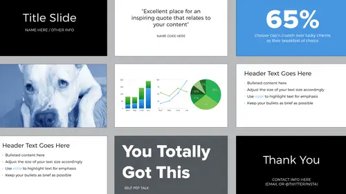
here at CreativeLive and what that means is I do all the programming for the art and design section. So I see a lot of presentations come through. I work with a lot of instructors and I see a lot of the same mistakes being made over and over. So this class is intended to help address those mistakes and give you some tools that you can apply here on out. The bonus materials for this class are amazing. There's template files so you can follow along with those and create your own template and it's very well designed, and those are in PowerPoint and Keynote formats. And then there's a resource list and at the end there's a final checklist.
Class Materials
Bonus Materials with Purchase
Ratings and Reviews
Dave Pasciuto
This is a very basic class focused for a beginner, but explained well. I was hoping to see some great, successful and unique designs, but none were given. Much of the information here is beginner graphic design basics.
Josh Hersh
People often overlook the fundamentals of building a great presentation. We've all seen too many different typefaces, crazy typefaces, and distracting formatting and colors. Lara teaches you to build a presentation from the ground up, reminding us that the content is vitally important and that design is used to communicate, not decorate. I really appreciate the seemingly "small" tips that add up to make a big difference. I'll have much more awareness going into my next presentation. Thanks, lara!