Lesson Info
3. Size & Orientation of a Business Card
Lessons
Class Introduction
03:42 2What Information to Include on your Business Card
01:56 3Size & Orientation of a Business Card
03:31 4Choosing a Hierarchy & Layout for your Business Card
09:10 5Choosing & Using Fonts for your Business Card
09:36 6Color Combinations on a Business Card
06:47 7Logos & Images on a Business Card
06:53 8Printing & Paper Options for a Business Card
03:54Lesson Info
Size & Orientation of a Business Card
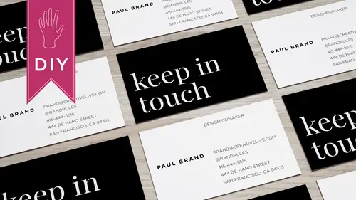
So when you're choosing a card size let's start there, the standard size is three point five by two inches, so most cards are that size. Now if you deviate from the standard size, you really have to consider the pros and cons, so I don't know about you, but when I get an oversized business card and it doesn't fit in my wallet, I get kind of annoyed um and it may not fit in my business card holder, so already it's sort of like this up to thing that's bugging me and I'm likely to throw it in the trash, so be careful when you do something different from the norm. I've often times received smaller business cards and they sort of get lost in the shuffle and then when I'm like changing business card holders, all of a sudden it falls on the floor and I'm like, oh, I totally forgot about that because it's so small it's just got lost, so I recommend sticking to the standard size unless you have a really good reason for going beyond that. Some of the options first sizes outside of three point fi...
ve by to include a boxier shape and I have an example here actually let me use my creative life card so this is a box your shape and it's actually a european size so you can see up against a normal card it's a little bit shorter and taller, and then I have an example of a smaller size and her card it's actually a little bit shorter, so depending on your printer, there are options for different sizes, but deviating from the norm could mean it ends up in the trash, so be thoughtful orientation, so landscape versus portrait you have basically two options landscape is traditional, so this is the horizontal version. Sometimes I do get portrait cards, and you've probably seen them, and most of the time I feel like there's not enough room for the information on the portrait card, because if you have your email address stretching across the bottom and feels really crowded, I do have an example where that works really well, because she doesn't have a lot of information on her card. So this is ari honest card, and she has her email address it's not too long the uriel for her website in her name, and it fits the content because she makes these prints that are portrait size, so she actually has these prints on the back of all her cards and what's nice about this is I actually want to hold on to this because of what it says and put it on my refrigerator and then maybe a lot later on say, oh, I mean, I remember meeting her let me reach out to her when we give her some business papers. Some money. So that's a great example of a card that you hold on to. Because it's clever it's well designed.
Class Materials
Bonus Materials with Purchase
Ratings and Reviews
a Creativelive Student
Hey Lara! I just checked out your course on CL, How to Design Business Cards, and absolutely loved it! Everything about the course was awesome from content, information, presentation, and your personality. Would you please do more courses? You have a wealth on knowledge, I can tell, and with your easy-going presentation it is a great combo. I would love you to do a course on InDesign or simply on design with various projects from business cards, posters, brochures, etc. Anyway, thank you for that course. You rock! Thank you for your time.
a Creativelive Student
I'm designing my first business card and Lara took it step by step so clearly that I've got something I can be proud of right out of the gate. She showed great strategies to make them professional and attractive and bonus ideas about how to get people to keep them around for reference. That's pure genius!
Sara C. Madsen
Great, little course. Inspiring.