Elements of Design - Color
Lesson 26 from: Mastering Photographic Composition and Visual StorytellingChris Weston

Elements of Design - Color
Lesson 26 from: Mastering Photographic Composition and Visual StorytellingChris Weston
Lessons
Your 10,001st Photograph
03:24 2Camera Gear
03:03 3Piece of Gear We Always Forget
03:47 4Be a Storyteller
03:09 5Finding Ideas For Photography - Know Your Subject
06:59 6Cae Study - Why Are Zebras Black and White Striped
01:30 7Photograph What You Love
02:00 8See the Extraordinary in Ordinary Things
01:31Have an Opinion
01:46 10See With a Child’s Eyes
02:34 11Tell Your Story
08:46 12Find a Needle in the Haystack
01:38 13Lions Hunting Under Star Trails
04:21 14Ansel Adams and Visualisation in Practice
03:20 15Keeping an Open Mind and Thinking on Your Feet
02:47 16Case Study - The Maternal Bond
02:42 17Don’t Tell the Same Old Story
02:38 18Relevance
01:06 19#1 Reason Photographs Fail
02:57 20Getting Rid of Clutter
03:59 21Post Capture Cropping
02:04 22The Elements of Design
02:31 23Elements of Design
01:38 24Elements of Design - Shape
02:21 25Case Study - Shape
02:11 26Elements of Design - Color
01:55 27Case Study - Color
01:50 28Color in Camera
01:42 29Pattern
01:54 30Texture
02:24 31Seeing The Elements of Design
08:52 32Gestalt Theory
05:10 33Case Study - Cove
01:36 34Case Study - Hat
02:09 35Light and Contrast
01:54 36Light and Form
01:26 37Light and Depth
03:48 38Perspective
02:28 39Lenses and Perspective
02:47 40Rule of Thirds
02:48 41Centre of Frame
01:36 42Case Study - Positioning the Subject
01:48 43Positioning the Subject - Dynamic Symmetry
03:20 44The Horizon Line
02:52 45Should the Horizon Line Always be Straight and Level
02:13 46Other Lines
04:57 47Rhythm, Balance, and Visual Weight
02:59 48Negative Space
02:29 49The Two Most Important Controls on Your Camera
03:41 50Training the Mind
04:26Lesson Info
Elements of Design - Color
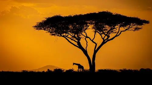
of all the elements of design, color is the most powerful. As humans, we attach many emotional connotations with color. Red means danger. Green means healthy. Think of a traffic light, for example, because color is so linked to emotion is the element that, more than any other, creates mood. Warm colors such as red and yellow and orange make us happy. Cold colors such as blue give off a more melancholic feeling, but warm and cool colors together on the warm color will project forward while the cool color receives creating a sense of depth. Complementary colors that is, those sitting opposite each other on the color wheel, such as red and green or orange and blue appear more vivid when placed next to each other, which draws attention to them. Color can also create visual or implied energy because of their different wavelengths. For example, a picture of a red leaf against a green background will appear mawr three dimensional because red has a longer wavelength than green. Bold, vivid col...
ors will live in an image making their subject stand out, or you can use softer pastel colors to create a more sensual mood. Color also creates context revealing the scene in the same terms that we perceive it, which makes it more true to life. Because color is such a powerful communicator, it can also be overwhelming, smothering the other elements of design. So if textural patterns say are key elements in your composition, consider converting the image to black and white because it will allow those elements to stand out more now because color is so expressive is a great element to experiment with as you'll see in the next lesson.
Ratings and Reviews
Edmund Cheung
Perhaps the style of presentation and simple, short, and direct messaging does not "jive" with some; but others may really love this. Yes the production of each episode is stylized and perhaps a bit formal (like a TV Show?), but there is something to be said about it. Perhaps this is not meant for professional photographers? I think of myself as decent amateur / high level photographer. I found lots of great nuggets of wisdom and inspiration from this. Especially when I an in a rut for creativity. Yes I have heard all these concepts and ideas before. BUT it is always great to hear and see a different way of presentation and voice. Please do NOT take the naysayer reviews as the end all. You should judge for yourself and watch a few episodes. If the style and content click for you, I would highly recommend this course.
Abdullah Alahmari
Thanks a lot to mr. Chris Weston This course is great and It is a 🌟 🌟 🌟 🌟 🌟 course for me. Beside the other course ( mastering the art of photography ) both courses are Complementing to each other and highly recommended.
Kai Atherton
While I am perhaps more advanced in my photography then this course. It is always great to be able to go back to fundamentals and remind ourselves of the basic principles, and even camera function. I thoroughly enjoyed this course and Chris's other. It is a great motivational jumpstart when lacking fresh creative idea's.
Student Work
Related Classes
Beginner