Negative Space
Lesson 48 from: Mastering Photographic Composition and Visual StorytellingChris Weston

Negative Space
Lesson 48 from: Mastering Photographic Composition and Visual StorytellingChris Weston
Lessons
Your 10,001st Photograph
03:24 2Camera Gear
03:03 3Piece of Gear We Always Forget
03:47 4Be a Storyteller
03:09 5Finding Ideas For Photography - Know Your Subject
06:59 6Cae Study - Why Are Zebras Black and White Striped
01:30 7Photograph What You Love
02:00 8See the Extraordinary in Ordinary Things
01:31Have an Opinion
01:46 10See With a Child’s Eyes
02:34 11Tell Your Story
08:46 12Find a Needle in the Haystack
01:38 13Lions Hunting Under Star Trails
04:21 14Ansel Adams and Visualisation in Practice
03:20 15Keeping an Open Mind and Thinking on Your Feet
02:47 16Case Study - The Maternal Bond
02:42 17Don’t Tell the Same Old Story
02:38 18Relevance
01:06 19#1 Reason Photographs Fail
02:57 20Getting Rid of Clutter
03:59 21Post Capture Cropping
02:04 22The Elements of Design
02:31 23Elements of Design
01:38 24Elements of Design - Shape
02:21 25Case Study - Shape
02:11 26Elements of Design - Color
01:55 27Case Study - Color
01:50 28Color in Camera
01:42 29Pattern
01:54 30Texture
02:24 31Seeing The Elements of Design
08:52 32Gestalt Theory
05:10 33Case Study - Cove
01:36 34Case Study - Hat
02:09 35Light and Contrast
01:54 36Light and Form
01:26 37Light and Depth
03:48 38Perspective
02:28 39Lenses and Perspective
02:47 40Rule of Thirds
02:48 41Centre of Frame
01:36 42Case Study - Positioning the Subject
01:48 43Positioning the Subject - Dynamic Symmetry
03:20 44The Horizon Line
02:52 45Should the Horizon Line Always be Straight and Level
02:13 46Other Lines
04:57 47Rhythm, Balance, and Visual Weight
02:59 48Negative Space
02:29 49The Two Most Important Controls on Your Camera
03:41 50Training the Mind
04:26Lesson Info
Negative Space
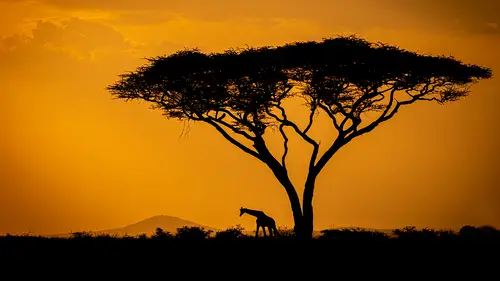
negative space is the area around the subject, the subject sometimes being referred to his positive space. Now the term itself is a little misleading, as correctly used negative space defines your point of interest and creates a balanced composition. So what do I mean by correctly used? Well, toe Answer that question. Let's look at some examples where it's been used badly in this image. The subject is positioned to close to the edge of frame, which creates an imbalance. This image shows the opposite. Too much space. The viewer is left wandering aimlessly, wondering what the point of the photo is. The skill, then, is defining what is too little on what is too much as usual. There's no right or wrong answer. As you have heard me say many times throughout this course, It depends on the story you want to tell. One of my favorite wildlife subjects is bears, and this is one of my favorite images of a bad your notice. There's a lot of negative space. In fact, it makes up half the frame, but i...
n this example, when you compare the amount and shape of negative space, you'll see it perfectly balanced by the positives base made up by the Bear on the Rock. This is a spirit back on my story, which is that of an apparition emerging from the ether, is clearly defined by the way I've used positive and negative space in the composition. And here's another example. I usually avoid photographing wildlife from the high viewpoint. However, on this occasion the aerial view of the negative space it creates work perfectly. First, it gives the image context straightaway. We know the crocodile is in its natural habitat. Secondly, it frames the shape of the crocodile. So in this example, the negative space has made sure the unusual angle doesn't create an abstract image and has defined the visual narrative. Negative space is an important element in composition, but assessing how to use it effectively can be hard to define. Often I find it's more feeling than a mathematical formula. When I was starting out and activity, I found useful was looking at how other photographers and artists used negative space and then practicing those observations. When I was out in the field off for a while, I found I was using it instinctively. So the best advice I can give is practice, practice, practice no
Ratings and Reviews
Edmund Cheung
Perhaps the style of presentation and simple, short, and direct messaging does not "jive" with some; but others may really love this. Yes the production of each episode is stylized and perhaps a bit formal (like a TV Show?), but there is something to be said about it. Perhaps this is not meant for professional photographers? I think of myself as decent amateur / high level photographer. I found lots of great nuggets of wisdom and inspiration from this. Especially when I an in a rut for creativity. Yes I have heard all these concepts and ideas before. BUT it is always great to hear and see a different way of presentation and voice. Please do NOT take the naysayer reviews as the end all. You should judge for yourself and watch a few episodes. If the style and content click for you, I would highly recommend this course.
Abdullah Alahmari
Thanks a lot to mr. Chris Weston This course is great and It is a 🌟 🌟 🌟 🌟 🌟 course for me. Beside the other course ( mastering the art of photography ) both courses are Complementing to each other and highly recommended.
Kai Atherton
While I am perhaps more advanced in my photography then this course. It is always great to be able to go back to fundamentals and remind ourselves of the basic principles, and even camera function. I thoroughly enjoyed this course and Chris's other. It is a great motivational jumpstart when lacking fresh creative idea's.
Student Work
Related Classes
Beginner