How to Achieve an Instagram Look
Lesson 8 from: Urban Landscape Post-Processing TechniquesSerge Ramelli

How to Achieve an Instagram Look
Lesson 8 from: Urban Landscape Post-Processing TechniquesSerge Ramelli
Lesson Info
8. How to Achieve an Instagram Look
Lessons
Getting Started with Camera Raw
08:56 2Working with Local Tools
11:01 3Stitching a Panorama in Camera Raw
11:52 4HDR Cityscapes in Camera Raw
09:39 5How to Process a High ISO Cityscape Image
10:02 6How to Remove Tourists in your Images
13:54 7How to Master Sky Replacements
10:06 8How to Achieve an Instagram Look
04:54Lesson Info
How to Achieve an Instagram Look
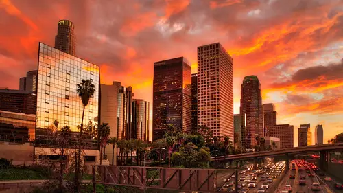
No, this is what I call the Instagram. Look, the Instagram look is very popular. What is instagram Look? Well, let me show you. There is a lot of looking Remember, There's one look that's really cool with cities, and it's here. So I'm gonna take this photo. This is a photo data shot in New York for my New York book. And, uh, now I'm not going to do what I usually do. I'm gonna go for look. So on this one, I'm gonna crush the blacks with a crushed of blacks and I'm gonna boost the whites. I'm gonna take my highlights to make it very bright. Gonna make my photo very bright. So you want to sort of like an overexposed kind of look, But that's not the trick. Let's make this foot of straight. So I'm gonna go here and click on photo, see if it makes it a bit more straight. Yes, before after Like that. And I'm gonna go likely here. And we have not tuggle this the U saturation limits and usually what I usually do is I take a go to saturation. I take anything which is warm, and I warm it up and ...
anything which is not not warm, even the greens. I make it a de saturated. So I'm pushing anything, which is red, and I'm taking out anything, which is I'm getting this off. Look, that's very popular. Ah, I'm gonna go back here. I think I'm gonna add more contrast on this one at charity without charity. And we get this sort of look that we see a lot of instagram, you know, it's like basically, it's a lot of contrast. And small separation sometimes even decelerate even more, you know? So it's almost like a black and white weighs a bit of color. Okay. And what you can do at this point, what you can do at this point is you can go here because now you've gone through all that trouble to create that look. You can go here and you see, I've got different presets and I can go and kick here and save sittings. I'm gonna call this I'm gonna click Save. I'm gonna call this Instagram. Look, for example, one is many. I'm going to click on Save and I'm gonna click on Done. Now I can go back to bridge so and Let's take this other photo, for example, of New York. I can go here and I can click on Instagram. Look one and in one click I give the look. Now, of course, this one needs to be crop. But everything that I did you know, the making it, you know. And of course, you can always go back and says, Oh, yeah, that's kind of over too much exposed. I can go here and maybe I wanna I don't want it so decelerate I could bring back some colors and you know, whatever you want. And I'm gonna go here in the crop tool, and I'm gonna crop here, Maybe this and this, but that look is kind of popular. Show you a few different photos and, you know, it's just look before after before, after So photo of the Arctic tree off in Paris. I go here and Instagram look boom. And in a sort off. And this is another one that I did, you see, So I can go from one look to the other, and, um Well, let's see what else I got for you here. And I'm sorry. Um, at the photos of the arc de Triomphe that I shot. And I love that because, you know, look, for me is a starting point. It's not an endpoint like click here. I'm like, Oh, you know, you see a lot of this look, you know, or you know Oh, why not? You know, I prefer this one. So that's part of the thing you're getting. And you know, it's only a starting point. You can go here and I'm like, eyes a little too strong. I can go here and here and Voila, Yes, Um, when you are correcting for white balance, I noticed that you use the selections rather than the eyedropper tool. Yes, I always do that. It's just, you know, the only time I used the eyedropper tool is when I shoot into a design and I need the better to be re white or the And then I would do that. But landscape no landscape is all about the feeding, the artistic, the you know, the the colors you want to communicate. So I I always do that were flown landscapes, but not introduce on your why I use the eye. Torbert
Class Materials
Bonus Materials
Ratings and Reviews
Kat
I loved this class. It was simple and easy solutions to processing beautiful images. I came away with so many ideas on how to improve my photo editing skills. Thank you.
Pleshette Fambrough
Excellent class. Simple to follow, great examples and real techniques to help me take my photography to the next level. Thank you!
Beatriz Stollnitz
Good class for anyone looking for tips and tricks to improve their landscapes and urban photos. This is not an advanced class, but it helps if you have some experience with Lightroom or Bridge.
Student Work
Related Classes
Adobe Photoshop