Lessons
Introduction to Wireframing
06:41 2What is Wireframing?
04:21 3Setting Wireframing Expectations
04:48 4Defining The Problem To Solve
05:08 5Sketching and Refining the Idea
33:14 6Overview of Sketch Software
09:13 7Create a Wireframe in Sketch
17:31 8Effectively Presenting Your Work
02:12Lesson Info
What is Wireframing?
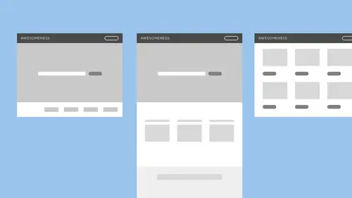
So, what is wireframing? I don't know what you guys first think of when you hear wireframe, but to me, I picture an actual structure made of wire. Maybe you're thinking of a sculpture that they start that way. So, you're building this foundation on the inside. It's the skeleton of your content. Wireframing is also a tool to understand functionality. So, I've touched on this already. What we're really focused on is when you come to websites, there's lots of different things that are on every website that you're gonna recognize. There's the logo, the navigation, there's maybe drop downs and different content blocks, and when you're doing wireframing, what you're thinking about is what content do you have? What are you trying to solve for? and just blocking out those different things so that you can understand the best way to build your site. And so with that, wireframing is basic shapes and text. We're not using a lot of color. It's pretty much all black and white and gray. We're not wor...
ried about type faces or really the sizing of things. When we get into Sketch, we're gonna see that there's some of that. You want to use your wireframe shapes to indicate different things. So, maybe you're using rounded corners on your buttons and that's gonna indicate what a button is every time you see it. And you're using square edges for your input fields or your drop downs. But we're really, really not gonna be worried about what the visual design looks like right now. So, wireframing is not visual design. Wireframing is not coded. We're not gonna do anything fancy here other than basically pen on paper. You could technically do your wireframes on pen and paper. When I started designing, so, I have a BFa in graphic design. Not once in my college education did we learn wireframing. It is all stuff that I learned on the job and didn't know what wireframing was. I didn't know what fidelity it should be at. I didn't really know what the world fidelity meant. But really what it is. So, fidelity is the sort of level of execution. Low fidelity is gonna be a pencil sketch on paper. High fidelity is gonna be a super polished, ready to launch visual mock. And so wireframing is definitely towards the lower end. A little bit higher than pencil on paper. You want to make sure that it's easy for someone to understand. Clear, you know, not all of our handwriting is legible. So, that's why we bring it into Sketch, but it's really just a simple, simple tool. And it's not the final product. So, with all of that with being sort of lower fidelity, it's not gonna be the final thing that gets coded and that's an important thing to discuss with your clients. Sometimes it's hard for non designers or not necessarily creative thinkers to be able to see something in black and white and envision how it's gonna look when it's totally finished. So, over communicating that to the people that you're working with, so that we're all on the same page about what it is that we're looking at, is gonna be really important. So, this is a really simple example of one screen of a mobile app. We're gonna actually look at this when we talk about prototyping. But I just wanted to show you guys. So, this is a wireframe and how it can change when it goes into visual design. So, we have our basic elements here. The header bar of the app with the hamburger menu. Some contents there and a button. And when we actually style this, it could look like this. You can see our total's gotten bigger, tax looks a little different. Our button's moved down to the bottom, but it's still following that convention that we learned in the wireframe about the content we need and generally how it's going to work. And then it could look like this or completely differently and still follow the same wireframe. So, it's just a great way to really understand what your product is before you're getting into the visual design.
Ratings and Reviews
China Rose
Alexandra shares useful specific ideas to build confidence in website planning and shares her clever techniques for wire framing.
Lisa Brink
Great information. Would have been nice if she had a large pad or dry erase boards for the sketching so both online and people in the room could see better - as opposed to the 8.5 x 11 laying on the desk.