Non-Destructive Rendering in Photoshop
Lesson 11 from: Digital Rendering for DesignersJorge Paricio

Non-Destructive Rendering in Photoshop
Lesson 11 from: Digital Rendering for DesignersJorge Paricio
Lessons
Introduction
01:18 2Digital Rendering Overview
07:00 3Photoshop Settings for Digital Rendering
03:31 4Using Layers in Photoshop for Digital Rendering
04:46 5Using Masks in Photoshop
07:23 6Using Filters in Photoshop
19:59 7Using Selection Tools in Photoshop
07:19 8Retouching Sketches in Adobe Camera Raw
05:16Retouching Sketches in Photoshop
03:45 10Rendering a Coffee Maker Start to Finish
21:54 11Non-Destructive Rendering in Photoshop
07:09 12Intro to Sketchbook Pro
18:16 13Rendering A Car Start to Finish in Sketchbook Pro
19:49 14Adding Logos and Graphics in SketchBook Pro
02:36 15Rendering Interiors using Photoshop
15:53 16Adding Shadows with Burn Tool and Lasso and Feather
09:32 17How to Create Highlights and Add People to the Scene
12:05Lesson Info
Non-Destructive Rendering in Photoshop
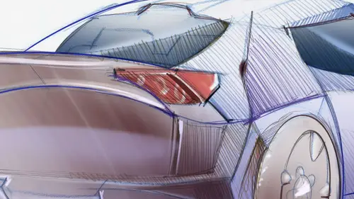
one thing that I want to note when you render We have covered pretty much. Everything here is that they're two different ways of rendering. This is called, huh? A destructive type of rendering, destructive in a way that you're really modifying the original red color that we had in the scene. Okay, but there is another way of working, which is non destructive. In other words, you should be able Teoh on thread or the construct everything step by step. So it's another way of working. Let me just show quickly what that means. Let's open up. Let's work on this fair. Quick. All right, We have something like this. Let's do you saturate it. Control l. We work with the different tonal range is something like this. This is looking very good already. Line work. We'll do a background layer here. All right, So the nondestructive were working. Would be. Every time you do something, it would be placed in a layer. All right. You might end up having lots of layers, but then again, you would be able to ...
rework everything little by little. All right. So, for example, for the cap over here, that's changed the tolerance to 20 pixels so that we would be able to selected a little bit bigger. Well, that's not working very well. Let's choose the top instead. That's not working either. Um, I would still have to work with a better tolerance or use my magnetic lasso tool. So we have these shape already selected will go to color and then we can use We can dump a color there. For example. We can use a slight Grady int. All right, maybe something like this, but in reverse, maybe something like that. Make sure that you go under multiply control, lead to de select. So that would be one step along the way. If you wanted to, for example, at ah highlight. Here you can add it on a new layer, so you would just have to added Here, highlight. You might want to go in this case to the last a tool feather of three pixels at a highlight There, remember use very sparingly your shift key so that you don't lock your keyboard. We select these two areas there feather of three pixels. And then what I can dio is just use my airbrush to paint on top marching ants. If they are very confusing, remember control age to hide them from view. They're still there. Whoops. That's too dark. Let's go very light. Ooh, I like that. It's looking very good. Nice reflections. Um, we can do the same thing here. It's add a tiny reflection over here. I would look great feather of three pixels control age. To hide it from view, you might have to do it a couple of times and you paint. Remember, opacity doesn't have to be 100%. It could be lower so that you have more fun with this. A couple more things here. This is the nondestructive way of working, which I think it's better course again. Can you can deconstruct everything you might end up having with hundreds of layers. All right, I've seen drawings with hand literally hundreds of layers, so just be careful about that. How to organize your work? You have to create folders here, so these would be one. When you click there over here, you click on a new layer. Over here, you click on a folder, undo your rename it, we'll call it top. So now these two layers you can hold shift to select this to you. Drag them inside, and now we would have them organized. You see these red collar over here? I went over a little bit. You can always add a mask to it if you want. Um, um, I actually masked everything out, so you can, but you can do here, ISS select this portion. Go here, click X and delete. So you would show the mask. I don't want to have that mask out. Let's see. Whoops that we got. That's what I wanted to do. So I have a mask applied to that we got. That's what I wanted to do. I want to fix this area here. All right. So, again, this is just to wrap up everything. Let's go, Teoh. Capacity 100% And we clean up our shapes. This is how we started this class right of this section. Working with our masks and filters. We have a good shape going on. Whoops. I deleted it. I didn't have to delete it. There you go. So how fun rendering in photo shop. Make sure that you work with your lawyers. You stack them correctly and just make sure to visit all the different layers, all the different examples that we have and explore them from top to bottom.
Class Materials
Bonus Materials with Purchase
Ratings and Reviews
Gigi
This is actually the course I was looking for. This is DIGITAL rendering, which in an odd way makes you appreciate hand drawn rendering. Great! Thanks!
Heather
awesome!