Drawing Banners to Title Cluster
Lesson 34 from: Layering in Adobe Photoshop for Digital ScrapbookersTraci Reed

Drawing Banners to Title Cluster
Lesson 34 from: Layering in Adobe Photoshop for Digital ScrapbookersTraci Reed
Lessons
Intro to Scrapbook Layering
04:15 2Paper: Your Layout Foundation
11:35 3Building Paper Strips & Blocks
12:04 4Create Chevrons with the Shape Tool
05:24 5How to Line Up Repeating Shapes
04:10 6Custom Shapes with Polygon Tool
09:27 7Make Your Own Pennant & Banners
10:47 8How to Add Interest with Your Photos
05:10Creating the Perfect Cluster
11:52 10Embellishments with the Visual Triangle
12:57 11How to Use the Visual Triangle with Pictures
03:06 12The Rule of Three
02:18 13Using the Power of White Space
04:43 14Using the Rule of Thirds
08:42 15Learn the Importance of Shadowing
10:30 16What is the Brush Tool?
05:16 17Using Brushes in a Layout
06:04 18Using Paint in a Layout
03:23 19Understanding Blend Modes
07:21 20Creating Mixed Media Mash Ups
05:19 21Using Layer Masks
02:41 22How to Blend Photos
03:16 23How to Blend Papers
02:17 24How to Blend Text
01:13 25Lighting Effects: Learning Radial Gradient
05:17 26Lighting Effects: Learning Inner Shadows
01:51 27Dodging & Burning Washi Tape
07:58 28Creating Custom Journaling with Text Tool
05:41 29Journaling with the Pen Tool
06:46 30Incorporating Journaling in the Design
04:29 31Making Stamps from Fonts
06:49 32Different Ways to Cluster with Alphabets
07:54 33Adding Embellishments to Titles
04:24 34Drawing Banners to Title Cluster
03:20 35Creating a Stitch Brush
12:21 36Creating Other Types of Stitching
08:03Lesson Info
Drawing Banners to Title Cluster
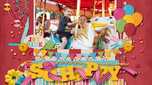
So let's talk about drawing banners and using text and and titles are end alphabets together, so sometimes we might have a bit of a longer title and we so instead of title here let's use the example tile goes here and so we want to have it take up not a lot of visual way because goes here wouldn't be very exciting, but it is part of the title, so we're going to add a banner to our title cluster that's going to be a shape so that we can use text with our title now to make it really dynamic we if we just put it on top of everything not very nice we just put it underneath everything it wouldn't be very nice either, so we can just like we did with the ribbon we can pull it on top of some letters and pull other letters on top of it so that it kind of messes in with our letters and then let's make it white um let's notch this banner like we did on the other one. So I know that I talked about when we were talking about papers that it's important to make sure that your anything that you want t...
o have a banner has a direct middle point so it's like exactly two inches so that you know one inches of direct center but if you don't have that option, you can also clicking got a click and drag a guide down to the center of something and now you know that that's the direct center of that banner, and you can add the anchor point to it on both sides because we're going to notch in on both sides and again, we wantto convert an anchor point because it's curved right now and then we can drag it in a little bit, holding down shift so it drags on the straight line, and now I'm gonna show you what happens if you don't convert that anchor point, you can see it's curved, but if you notice that that's a problem, you can always convert it afterwards, too. So now I'm just going toe goes here, and now you can mix your favorite text fonts, her texter, stamped fonts, even with your title what you find with this kind of titles, um, typically I used typewriter fonts for this kind of stuff for things that go on banners. I like the typewriter fonts because let's say you were you were using this fund specifically, it kind of mimics the title farmed, and so it it doesn't give enough variation, so if we go to typical writer again, instead it gives you a lot more variation then before
Class Materials
bonus material
Ratings and Reviews
Corrina
I have recently discovered digital scrapbooking and have been using a great scrapbooking software that I downloaded on-line. There are limitations with the software that prompted me to look deeper for ideas. Traci's course was fantastic! I learned so much from her not only in scrapbooking layouts and using different elements in a page but my level of understanding of photoshop has improved dramatically. The presentation was easy to follow and broken into perfect chunks to go back and review the techniques. Thank you so much Traci for presenting this awesome course. I will look for more of your courses. Your scrapbooking is beautiful and inspiring!
ChristyWhitehead
I'm a photographer. I do a lot of graphic design for my business. I feel like I'm fairly knowledgeable. I saw this class being shown for free on Creative Live one day and it wasn't my first choice to watch, but was the best out of the list... I was wrong. This is a great class. I didn't expect to learn that much and I've been learning a lot! Great info!
Lianne Kruger
Not only did she talk about how to do things in Photoshop [the computer steps] but she also explained art and design tips: what looks good and what doesn't on a page. That was a very nice touch.