Adding a Texture with Blend Mode
Lesson 4 from: Creating Mixed Media Art in PhotoshopKhara Plicanic

Adding a Texture with Blend Mode
Lesson 4 from: Creating Mixed Media Art in PhotoshopKhara Plicanic
Lesson Info
4. Adding a Texture with Blend Mode
Lessons
What is Mixed Media Art and What Can You Use to Make It?
08:12 2Getting Started
03:45 3Creating a Dynamic Background with Masks
10:53 4Adding a Texture with Blend Mode
03:49 5Using the Custom Shape Tool to Add More Variety
04:55 6Using Glyphs in Photoshop
03:14 7Adding Vectors
03:44 8Adding Fonts by Using the Brush Tool
10:14Lesson Info
Adding a Texture with Blend Mode
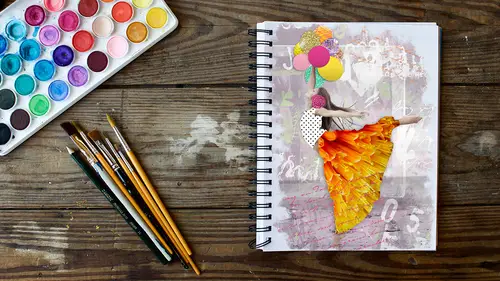
then I'm gonna go take one texture file here. So this is an example of like you could take a picture of a wall or something when you're just walking down the street and I'm just going to copy all of this and paste this in two. We'll put it on the very top, and I'll scale it a bit. So we have some interesting, maybe like that. And then I'm gonna change the blend mode here. And the way that I like to do that is with my keyboard, because sometimes I mean, I might have a good guess. What blood mode is going to be nice, but sometimes I like to just see all of them, and it really sucks to come over here and click through all of them. So there's a keyboard shortcut on a Mac. It's weird. You have to have the move tool for it to work, and then it's shift and plus or minus on a PC. I want to say it's been a while since I had my hands on one, but I want to say you can just click in here to activate it and then use your down arrow key on your keyboard and it just scrolls through them. So that's re...
ally nice on a Mac. It's kind of a pain in the butt, but once you get the hang of it, it's pretty simple. So now I'm just going to go through and see how I can have this texture interact in a way that I like. So I'm not so much wanting it for color, cause I like the color from all the stuff that we've built. But it is nice to get a little grit from it. So I'm gonna go maybe with something who that was interesting. I think it's too dark for what we're doing, but that's awesome. So probably going to go with something like Maybe overlay, I guess. And maybe I faded a little bit. It's kind of making the colors a little, too. I might adjust the the saturation, but we can see we can see if I zoom in here. If I hide that layer, we are losing a lot of texture. So this graphic this layer is really adding a lot of texture to the whole thing so we can dial that up or down by playing with capacity. Okay, So once we're happy with our crazy mash up of stuff here, then I'm going to copy the whole thing and paste it into our image. Maybe I would save this file so that I have access to all of this if I want to edit it later. But right now I'm doing a press command, control a Teoh, select the whole thing, and then I can still leave the layers separate, and I can copy a merged version of it. So if we come up to the edit menu, we can choose copy merged, and that will copy it as if it's all on one layer, even though it's not so, I can avoid having to drag this whole mess into my composite so we'll come over here and now when I paste it in, we see it comes in is one flat layer. So that's a neat thing that I find super useful, and I'm gonna drag it down below this layer, and then we can experiment a little bit with the blend modes for this layer, like maybe multiply is going to be a good one. Let's see, maybe, Well, I kind of like that, too. Tough decisions. We'll stick with multiply for now. Maybe we faded a little. Something like that
Class Materials
Bonus Materials with Purchase
Ratings and Reviews
Natalie Shihor
Really inspiring! I've learned new techniques and fun stuff, and I'm really excited to try it. BUT - this course is for advanced photoshop users. If you just started, come back again in the future.
a Creativelive Student
Excellent tips and inspiration. I've used Photoshop for many years and still I learned many shortcuts and techniques that I didn't know existed :)
a Creativelive Student
Enjoyed this class. Thank you CL and KP!
Student Work
Related Classes
Adobe Photoshop